
I recently read this post by Marilyn Roxie on the colour symbolism of the genderqueer and non-binary flag. The colours of the flag – lavender, white and dark green – are similar (but not exactly the same!) as those used by the Women’s Social and Political Union. Marilyn describes their decision to use those particular colours and their meanings as follows:
Lavender (#b57edc): The mixture of blue and pink (traditional colors associated with men and women, present on the transgender pride flag) as lavender is meant to represent androgynes and androgyny. Also represents the “queer” in genderqueer, as lavender is a color that has long been associated with “queerness” , including gay, lesbian, and bisexual communities.
White (#ffffff): Meant to represent agender identity, congruent with the gender neutral white on the transgender pride flag.
Dark chartreuse green (#4A8123): The inverse of lavender; meant to represent those whose identities which are defined outside of and without reference to the binary. Formerly (#498022), the color is now the true inverse of lavender (#b57edc).
The three colors are not meant to indicate that any of these identities are entirely separate or opposites of one another conceptually; they are all interrelated as well as key concepts in their own right, and there are more concepts and variation of gender and sexuality present that tie into genderqueer identities than can be listed here. The purpose of the flag is to help create visibility for the genderqueer community and related identities.
However, Marilyn was recently criticised for the genderqueer/non-binary flag’s perceived similarity to the colours used by the WSPU.
Needless to say when earlier I received the two messages “this is not a creation, but an appropriation ” and “Ya nicked it!” I just started shaking and trying to hold back tears
I’m not sure I’d agree the use of similar colours in the genderqueer/non-binary flag is appropriative; for me, “appropriation” involves a power dynamic that I’m not convinced is present here. However, I think there’s an interesting history of how colours were used by both suffrage organisations and in the LGBTQA movement to identify groups and voice identities.
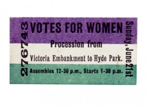
Front view of an admission ticket to the Hyde Park demonstration organised by the Women’s Social and Political Union on Sunday 21st June 1908 (from the Museum of London)
Colours were used extensively by suffrage societies and organisations. Elizabeth Crawford (1999: 137) lists colours for over twenty such groups, including the National Union of Women’s Suffrage Societies (red, white & green), the Catholic Women’s Suffrage Society (blue, white & gold), the Conservative and Unionist Women’s Franchise Association (pale blue, white & gold), the Jewish League for Woman Suffrage (purple and celestial blue), the Men’s League for Women’s Suffrage (black & gold), the Tax Resistance League (black, white & grey), the Votes for Women Fellowship (purple, white & red) and the Women Writers’ Suffrage League (black, white & gold). I think it’s interesting that some colours are used extensively – white and gold seem particularly prevalent.
Many suffrage organisations took part in marches and demonstrations; the use of colours, particularly in the form of brightly coloured, elaborated banners, created a visual spectacle. You can view some of these banners and designs at The Women’s Library’s collection. Lisa Tickner (1987: 60) discusses the significance of these banners as used in marches and demonstrations:
Banners served both as rallying points for the march and as commentary on it. Women formed up around them in predetermined sequence, so that a procession several miles long could be ordered according to its programme and move off smoothly. At the same time, for the onlookers (and for readers in the next day’s newspapers perusing their half-tone photographs), they acted as a gloss on the procession itself, developing its meanings, identifying and grouping its participants and clarifying its themes. Together with the programme of the march, the banners emphasised the broad base of suffrage support, the diversity of women’s achievements and the benefits the women’s vote would bring to society at large. In this sense they were an essential part not just of the spectacle of suffrage demonstrations but of their argument. They went some way to informing the casual onlooker as to the ‘what’ and ‘why’ of women’s presence on the streets.
Meanwhile, badges, scarves, ribbons and buckles in the appropriate colours were also available to buy from suffrage organisations, particularly the WSPU. Their sale was a useful source of income for the organisation and advertised its cause, but also served to declare the wearer’s political beliefs and affiliation.
I absolutely understand Marilyn’s desire to distance the genderqueer flag from a gendered history of specifically women’s political activism; that’s fine, and I’m not trying to force that on them or on this flag. However, this use of flags and colours to articulate identities, emphasise diversity, declare beliefs and provide a rallying point has a long and distinguished history, yet is entirely familiar. It’s something we can relate to and understand. We can still speak a language of symbolism and colours, are still able to fluently interpret it. I’d argue is why the genderqueer flag – and, indeed, many pride flags including transgender, leather, bear, asexual, pansexual etc – exist at all. In that sense, the existence of a genderqueer flag is entirely congruent with an older history of visibility articulated through brightly coloured flags.
References:
Crawford, E. (1999). The Women’s Suffrage Movement: A reference guide 1866-1928. London: Routledge.
Tickner, L. (1987). The Spectacle of Women: Imagery of the Suffrage Campaign 1907-14. London: Chatto and Windus.