Still ill, much to my annoyance. The only productive thing here has been my cough (ba-dum-tish!)
Anyway, today I tried to do some work chasing up a reference. The library had it (yay!) but only through ebrary (boo!). Every so often I wonder if my resistance to ebrary is because I’m being a luddite and refusing to use something that will make my life much easier. Then I actually have to use ebrary and realise that no, I’m entirely justified in this.
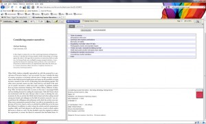
The above screenshot shows what it looks like on my monitor. I am deeply puzzled as to why the contents page needs to take up so much of the screen, leaving the text itself cramped to one side.To me this seems counter-intuitive – after all, I want to read the text – but what do I know, I’m only a researcher.
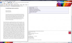
I am also puzzled as to why their top menubar doesn’t move as you scroll down the page:
You either have the choice of making the text bigger and easier to read OR having to scroll up every time you want to turn the page. It’s tedious.
In conclusion, I don’t think it’s reading a book through a web interface that makes me cross, it’s the peculiar and inflexible design decisions that are making me cranky. Digital and online interfaces are all well and good, but good, thoughtful design is so important to make them usable.
(and yes, I’ve checked Google Books (the chapter I want isn’t available) and I’ve checked Amazon (the book’s £88 and there doesn’t seem to be a paperback). If there was an alternative less annoying than ebrary, I’d use it.)


